Don’t miss out on unlocking your creative potential! Discover the simple, step-by-step method to create ASCII art, transforming plain text into stunning visuals. Perfect for beginners, this guide demystifies the process, ensuring you can start creating your own art pieces effortlessly.
To make ASCII art, choose a character set, sketch a simple grid-based design, and replace the grid points with your chosen characters. It’s that straightforward!
Keep reading to master ASCII art quickly! Our easy-to-follow guide ensures you’ll not only learn fast but also enjoy the creative process. Get ready to impress with your new skills!
Understanding ASCII Characters
What is ASCII? ASCII stands for American Standard Code for Information Interchange. It’s a character encoding standard used in computers and electronic devices to represent text.
Character Roles in ASCII Art: In ASCII art, characters are not just letters but tools for shading and texture. Characters like $, @, and # are great for dark areas because they are dense. Lighter characters such as . or , work well for highlighting and subtle details.
Visual Significance: The choice of character impacts the visual weight and texture of the art. Dense characters create a solid, heavy look, while lighter characters can give a delicate, fine appearance. This play of characters allows artists to mimic gradients and contours found in more complex images.
Crafting Images: By arranging these characters in a grid, artists can craft representations of everything from simple objects to intricate scenes, all relying on the visual contrast between the different characters.
Experiment and Explore: Each ASCII character has a unique visual footprint. Experimenting with different characters can lead to discovering new textures and effects, enhancing the artistic process.
Choosing the Right Tools
Basic Tools: Text Editors
The simplest way to start with ASCII art is using basic text editors like Notepad or TextEdit. These tools are straightforward: they allow you to place characters exactly where you want them in a grid-like fashion. This manual method is great for learning the basics and understanding how ASCII characters can be used to form images.
Intermediate Tools: Word Processors
For those who find basic text editors too limiting, word processors like Microsoft Word or Google Docs offer more features. These can include different fonts and sizes, which can add an extra layer of depth to your ASCII art, though they require a bit more skill to ensure characters align properly.
Advanced Tools: ASCII Art Generators
For more complex and detailed ASCII art, specialized software and online generators like ASCII Art Studio or MonoDraw are ideal. These tools offer features such as:
- Automatic conversion of digital images into ASCII art.
- Customizable character sets.
- Real-time preview of how the art will look.
- Advanced editing capabilities that streamline the creation process.
Online Platforms: ASCII Everything
Online platforms like ASCII Everything cater specifically to ASCII artists, offering a suite of tools that range from basic to advanced. These platforms often include community features, allowing artists to share their work and tips.
Choosing the Right Tool
Your choice of tool should match your skill level and the complexity of the projects you intend to tackle. Beginners might start with Notepad, while experienced artists might prefer the versatility of ASCII Art Studio. Each tool offers unique features that can help bring your artistic vision to life.
Experiment and Learn
The best way to discover which tool suits your needs is to experiment with a few. Each artist’s preference will vary, and what works for one might not work for another. Embrace the trial and error process—it’s all part of the creative journey in ASCII art.
Basic Techniques of ASCII Art
These are the basic techniques of the ASCII art:
Choosing the Right Characters for Different Shades and Details
The essence of ASCII art lies in selecting the appropriate characters to convey different shades and details. Light characters such as ., ‘, and ` are perfect for delicate details and highlights. For medium textures, characters like :, ;, and + work well. Dark and dense characters such as @, #, and $ are crucial for deep shadows and bold features. This choice is pivotal in creating the visual depth that ASCII art is known for.
Tips on Density and Placement of Characters for Effective Visual Impact
The density of characters in an area of your artwork can significantly affect its perception. Denser characters create a heavier, more pronounced effect, ideal for shadowed or lower light areas. In contrast, lighter areas can be represented with sparser, less dense characters. Placement is equally important. Aligning characters in a way that follows the natural lines and curves of your subject helps enhance realism and visual appeal.
Importance of Maintaining Aspect Ratio to Avoid Distortion
An often overlooked but critical aspect of creating ASCII art is maintaining the correct aspect ratio. Characters in text editors are typically taller than they are wide, which can distort images if not adjusted for. To avoid this, artists must adjust the spacing between lines, ensuring that the width and height of each character are proportionally accurate. This adjustment preserves the intended image proportions, preventing elongation or compression of the artwork.
Utilizing Tools for Precision
Tools like MonoDraw or ASCII Art Studio can assist in managing aspect ratios and character placement with grids and rulers, simplifying these adjustments. For those working in simple text editors, paying close attention to line spacing and character alignment manually is crucial.
Practice and Experimentation
Mastering these techniques requires practice and experimentation. By continually adjusting characters, density, and spacing, you can refine your method and develop a keen eye for what makes effective ASCII art. Remember, each piece is a learning opportunity.
Step-by-Step Guide to Creating Simple ASCII Art
Here, we have provided you with a step-by-step guide to make you create simple ASCII art:
Starting Simple: Smiley Faces
Beginning with ASCII art can be as straightforward as creating smiley faces. This is a perfect starting point for understanding the placement and impact of different characters. Here’s how you can create a simple smiley face:
- Open a basic text editor like Notepad.
- Start with the eyes. Place two asterisks (*) for the eyes, spaced apart:
* * - Add a simple curve for the mouth using dashes (-). Place these on the next line, centered beneath the eyes:
*   *
 ---
This simple design introduces you to the placement and spacing of characters.
Progressing to More Complex Designs: Simple Fish
Once you are comfortable with smiley faces, you can move on to slightly more complex designs, like a simple fish. Follow these steps:
- Begin with the tail using greater than (>) and minus (-) symbols:
> - Add the body of the fish using a series of equal signs (=), and end with a capital O for the head:
>=====O - You can add an eye to the fish using a period (.) inside the O:
>=====O
      .
Creating Landscapes
As your confidence grows, you can experiment with landscapes. Start with elements like trees or hills:
- For a tree, use a vertical line (|) for the trunk and carets (^) for leaves:
^ ^^^ ^^^^^ | - For a hill, use slashes (/ and ) to create slopes:
 /\
/  \
/    \
Tips for Success
- Use a Fixed-width Font: Ensure your text editor is set to a fixed-width font like Courier to keep characters properly aligned.
- Plan Your Design: Sketching your design on paper can help you visualize the placement of characters.
- Experiment with Characters: Different characters can give varied textures and effects, so don’t hesitate to try new ones.
Practice Makes Perfect
Creating ASCII art is a skill that improves with practice. Start with these simple examples and gradually challenge yourself with more detailed designs. Remember, the key is to enjoy the process as you learn. Each piece of art you create brings you closer to mastering this unique form of digital creativity.
Advanced ASCII Art Techniques
Let’s talk more about the advanced ACCII art techniques in this section:
Mastering Shading and Texture
Advanced ASCII art goes beyond basic shapes, delving into shading and texture to create more lifelike and detailed images. The key to effective shading in ASCII art is using a range of characters to represent different tones. For instance, @, #, and $ can be used for dark areas; %, &, and + for mid-tones; and dots (.) and commas (,) for light areas. Layering these characters cleverly can create the illusion of depth and form.
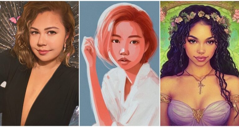
Creating Human Portraits
Portraits are particularly challenging due to the need for accurate detail and expression. When creating an ASCII portrait, start by selecting a clear reference image. Divide this image into a grid, and for each grid section, choose an ASCII character that matches the tone and texture. Pay special attention to key facial features such as the eyes, mouth, and hair, as these areas require precise character placement to capture the essence of the subject.
- Eyes and Lips: Use denser characters to define the pupils and the outline of the lips.
- Skin Tones: Use a gradient of ASCII characters from dark to light to mimic natural skin tones.
- Hair: Apply varied character strokes to suggest different hair textures and styles.
Designing Detailed Scenery
For scenery, the approach is similar but focuses more on creating a sense of scale and depth. Begin with the background elements, using lighter characters to create a sense of distance. Foreground elements should use darker, denser characters to draw them closer to the viewer.
- Sky and Clouds: Light characters like . and ` can suggest a hazy sky or fluffy clouds.
- Trees and Vegetation: Characters like #, %, and ^ are excellent for foliage, providing texture and shadow.
- Water and Reflections: Use a combination of horizontal lines (–), tildes (~), and slashes (/) to mimic water surfaces and reflections.
Tips for Advanced Artists
- Experiment with Scaling: Adjust the size and density of the ASCII characters to enhance the illusion of depth.
- Continuous Learning: Study different artworks and styles. Each ASCII artist brings a unique touch, and understanding their techniques can inspire your own creations.
By mastering these advanced techniques, you can elevate your ASCII art from simple designs to intricate, expressive creations that capture both the eye and the imagination.
Common Challenges and Tips for Success
Here are some of the listed challenges and tips for the success:
Challenge 1: Choosing the Right Characters
One of the first hurdles beginners face is selecting the appropriate characters for their artwork. The vast array of ASCII characters can be overwhelming, and using the wrong ones can lead to a lackluster result.
Solution:
Start by experimenting with basic characters. Use @, #, and $ for darker areas and . or , for lighter ones to understand their visual impact. Over time, incorporate more characters like |, +, and % to see how they affect texture and shading. Keep a reference chart handy to remind you of the visual weight each character carries.
Challenge 2: Maintaining the Artwork’s Layout
Keeping the layout consistent and avoiding distortion is a significant challenge, especially when working with different platforms that might render ASCII characters differently.
Solution:
Always use a monospaced or fixed-width font, such as Courier, to ensure that each character occupies the same amount of horizontal space. This consistency is crucial for maintaining the artwork’s structure. If you’re working in a text editor, regularly switch to a preview mode (if available) to check the artwork’s appearance.
Challenge 3: Scaling and Detailing
As beginners aim for more complex designs, they often struggle with scaling their work appropriately and adding sufficient detail without overcrowding the canvas.
Solution:
Begin with larger grids and simpler designs. As you become more comfortable, gradually increase the complexity. Use scaling to your advantage: larger designs allow for more detail, but keep in mind that adding too many details can make the image cluttered. Learn to balance detail and simplicity.
Challenge 4: Overcoming Frustration
It’s easy to become frustrated when designs don’t look as planned, especially after spending hours on them.
Solution:
Set realistic expectations and take breaks if you’re feeling overwhelmed. ASCII art, like any skill, requires practice and patience. Celebrate small victories along the way, and remember that each project teaches you something new.
Final Tip: Join Communities
Engage with online communities and forums dedicated to ASCII art. These platforms are invaluable for getting feedback, learning new tricks, and staying motivated through interaction with fellow enthusiasts.
By understanding these challenges and implementing these tips, you’ll enhance your ASCII art skills and enjoy a smoother creative journey.
Conclusion
In this article, we’ve explored various techniques and tools essential for creating ASCII art, from simple smiley faces to complex landscapes. We’ve covered basic character selection, detailed scenes, and addressed common challenges. Whether you’re a beginner or looking to refine your skills, the world of ASCII art offers endless creative possibilities. Share your ASCII art experiences and tips in the comments to help others on their artistic journey!

I am Sammy and I blog at Live it. Love it. Make it. It is creative lifestyle blog run by best friends H and Sammy. Head over and follow our crafty adventures!